Primary Blue 800
#0f2e4d for hero/header/footer and primary headings.
Relaunch design baseline with reusable tokens, components, and interaction patterns used across pages. The iconography section below introduces a biomedical illustration language.
Body copy uses Inter for high readability in dense scientific contexts and long-form method descriptions.
#0f2e4d for hero/header/footer and primary headings.
#8bc53e for CTA emphasis and active states.
#ffffff and #f4f7fa for clean clinical page rhythm.
Documented SOPs and controlled reporting outputs.
One study director per program lifecycle.
Decision-ready data packages and milestones.
Content-plan SVG icons are deployed across the site via four reusable CSS modules. Each module controls the presentation context — tile, split intro, figure break, or banner — while the icon itself carries the semantic meaning.
56px tile inside cards. Blue tint default, green tint + scale on hover. Used on homepage capability cards, overview hubs, and company entity cards.
Homepage example160px spot illustration beside the page-intro heading. Grid: text | spot. Collapses to stacked on mobile. Used on all 30+ content pages.
Live example50/50 text + spot split for visual breaks in long-form content. Alternating standard and reverse variants.
Live exampleCentered gradient-background illustration break between sections. Used on homepage modality section.
Homepage example24px icon in mega-menu column headers. Present on all 5 columns.
Hover Science in nav56px anchor icons in hero capability card. Desaturated by default, full color on hover.
Homepage heroThe set below provides one icon tile for every major point in the content plan. Visual direction uses soft outlined biomedical shapes, restrained fills, and semantic color accents.
All icons are generated as standalone SVG assets under /assets/icons/content-plan/ for review and iteration.

M1 icon token for the modalities system.

M2 icon token for the modalities system.

M3 icon token for the modalities system.

M4 icon token for the modalities system.

S1 icon token for the services system.

S2 icon token for the services system.

S3 icon token for the services system.
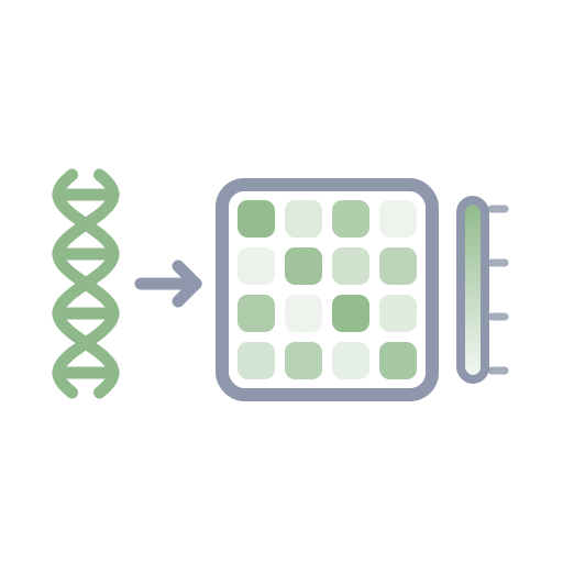
S4 icon token for the services system.

S5 icon token for the services system.

S6 icon token for the services system.
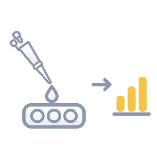
S7 icon token for the services system.

S8 icon token for the services system.

S9 icon token for the services system.
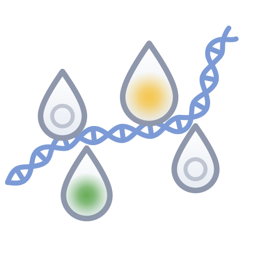
T1 icon token for the technology system.

T2 icon token for the technology system.

T3 icon token for the technology system.

T4 icon token for the technology system.

T5 icon token for the technology system.
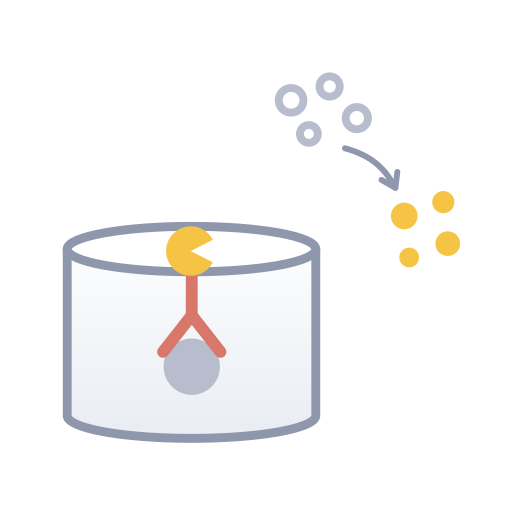
T6 icon token for the technology system.
T7 icon token for the technology system.

T8 icon token for the technology system.
T9 icon token for the technology system.
T10 icon token for the technology system.
T11 icon token for the technology system.
T12 icon token for the technology system.

T13 icon token for the technology system.

P1 icon token for the products system.

P2 icon token for the products system.
P3 icon token for the products system.
P4 icon token for the products system.
P5 icon token for the products system.

C1 icon token for the company system.

C2 icon token for the company system.

C3 icon token for the company system.

C4 icon token for the company system.

C5 icon token for the company system.

C6 icon token for the company system.

C7 icon token for the company system.

C8 icon token for the company system.

A1 icon token for the animals system.

A2 icon token for the animals system.

A3 icon token for the animals system.

A4 icon token for the animals system.

A5 icon token for the animals system.

A6 icon token for the animals system.

A7 icon token for the animals system.

A8 icon token for the animals system.

A9 icon token for the animals system.
Use :focus-visible and green focus ring for keyboard clarity.
Accessible node-based selector with keyboard support, active state clarity, and mobile stacking.
Different content types use different layout patterns. The variants below show which layout to choose based on the content structure.
Used for: Short modality pages with bullet-point content.
page-intro → section--soft → feature-list (ul)Used for: Content-heavy pages with multiple structured sections.
page-intro → content-section × N (h2 + p + feature-list + h3)Used for: Service pages with discrete focus areas as cards.
page-intro → section → grid-3 → card × NUsed for: All 13 technology detail pages.
page-intro → section--soft → tech-table + key-featuresUsed for: Technology overview and Technology Hub (locations).
page-intro → section--soft → tech-hub (list + panel, keyboard nav)Used for: Products page with categorized item grids.
page-intro → section--soft → product-group × NUsed for: Company timeline with vertical milestone markers.
page-intro → section--soft → timeline (ul)Used for: Company overview and text-heavy pages with alternating split.
page-intro → feature-row × N (text | media, alternating)Use light outlines and restrained fills for scientific neutrality. Reserve strong red hues for platelet/blood semantics only.
Use a 5-up grid on desktop and 2-up/1-up on smaller breakpoints. Keep icon area heights consistent for scanability.
Every illustration tile must include a text heading and a descriptive sentence so meaning never depends on visuals alone.
PDF · Direct download after providing a few details